The Handbook of Creative Data Analysis

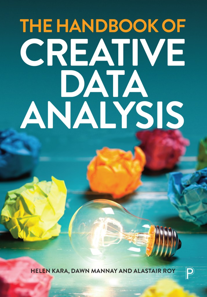
I am delighted to say that The Handbook of Creative Data Analysis was published this month. It’s a chunky tome with 29 substantive chapters, each outlining a creative method and its implications, plus introductory and concluding chapters by the editors.

Here’s how it came about. I first wanted to do this book in 2016. I knew it wasn’t a book I could write myself unless I could get some funding to research it – I applied for a grant from Leverhulme in 2017, for which independent researchers were eligible, but I was unsuccessful. I didn’t think it was a book that could be co-written, either. I thought of an edited collection, but wasn’t confident of doing that well enough on my own. And I didn’t have any good ideas about who to ask to co-edit with me.

Then in February 2021 I chaired a webinar on creativity in research for Policy Press with Dawn Mannay (Professor of Creative Research Methodologies at Cardiff) and Ali Roy (Professor of Social Research at UCLan). I already knew them both and it was a pleasure to do the webinar with them. We were surprised by the number of questions about data analysis, and after the webinar it occurred to me that they would be good co-editors for the book I had in mind. Then I considered their busy academic lives and figured they probably wouldn’t be interested. Then I thought I could just send an email to ask – nothing ventured, nothing gained… and they both said yes!

We decided Policy Press should publish the book and we put together a call for proposals. At this stage we were envisaging a standard-sized book with maybe 12 chapters. What we weren’t envisaging was around 60 proposals, most of which were really good. So we asked Policy Press if we could do a Handbook instead and they said yes. (Around this time I had also been asked to edit the Bloomsbury Handbook of Creative Research Methods. Fortunately I was able to divert a lot of the good proposals we couldn’t fit into the Policy Press Handbook to the Bloomsbury Handbook, so we didn’t have to reject too many outright.)

The process of editing this Handbook was a joy for several reasons. Dawn and Ali were great to work with – we named ourselves ‘good cop’ (me), ‘bad cop’ (Dawn), and ‘ambivalent cop’ (Ali)! I wanted to say yes to as much as possible, Dawn had a keen eye for quality standards, and Ali was great at seeing the merits of, and balancing, different arguments. And the combination of those three attributes was, in practice, greater than the sum of its parts. Then our contributors were, without exception, terrific, responsive, collegial people to work with. And Policy Press were thoroughly supportive throughout.

The part I liked best, though, was the learning. Each individual chapter held fascinating lessons and made me want to have a go at doing analysis with emojis, or reflective stitching, or word clouds. But there were some overall learning points, each made by several authors, that I found particularly interesting. The first is that any data can be analysed creatively: quant or qual, conventionally collected or creatively generated. The second is that analysis is not a discrete phase of research which falls between acquiring data and reporting results. Analytic work begins at the design stage of research and continues through dissemination and beyond. The third overall learning point is that doing analysis differently helps us to find new insights, learning, and understanding. The fourth is that analysing data often requires creativity, whether or not this is explicit.

Researchers use tacit as well as acknowledged creative practices to support their analytic work, and this is highlighted in several chapters. These tacit creative practices have always fascinated me. When I get stuck in the analytic mire, I write poems or create diagrams to help me move forward. Sometimes only half a poem or diagram, and my analytic poems never see the light of day though occasionally my diagrams do. But these techniques help my analytic thought processes. I was interested to discover other tacit creative practices, such as visual arts (doodling, drawing, collage etc), making (models, installations etc), music (to accompany and promote thought), and embodied practices such as walking, running and swimming. No doubt there are others too.

The fifth overall learning point is that analytic processes do not need to be fixed or rigid. This book demonstrates, in many ways, that analytic work can be experimental, playful, and fun.

At present the book is only available in hardback and digital versions. The digital version is much cheaper than the hardback, and you can get a 25% discount on either version by signing up to the publisher’s e-newsletter. If you are at college or university you should be able to get hold of a copy from the library. And there will be a paperback in due course. I am so happy that this book is out in the world because I think it will help a lot of people.

Creative Data Analysis – Call for Chapter Proposals

I have wanted to make a book on creative methods of analysing data for years. I knew it wasn’t a book I could write on my own unless I did a load of research. I would have loved to do that, but I needed funding, and there are very few funds I can apply to as an independent researcher. I did try Leverhulme but got nowhere. Then I thought about an edited collection, which I probably could have done on my own but I figured it would work better with co-editors. And I wasn’t sure who to ask, so the whole thing stayed on my wishlist.

Then, back in February, I co-hosted a webinar for my publisher Policy Press on creativity in research. My co-hosts were Dawn Mannay from Cardiff University and Alastair Roy from the University of Central Lancashire. We had over 200 attendees on the day, and far more questions than we could answer, including several questions about creative data analysis. This reminded me of my wish to make a book on the subject, so I asked Dawn and Ali if they would co-edit with me. And they both said yes!

Over the summer we have worked with Philippa Grand, my lovely editor at Policy Press, to put together the call for chapter proposals. I am really pleased with what we have produced, not least because we managed to keep it to one page of A4. I can’t wait to see the proposals that come in – though I will have to because the deadline isn’t until 31 December. But I feel so happy about this book because I know researchers in all disciplines around the world are devising and adapting analytic methods in many creative and useful ways, and I am really glad to have an opportunity to help collate some of that information so it can help other researchers in the current and in future generations.

Having said that, there is a whole process to go through. Once we have accepted and organised the chapter proposals, we need to write a proposal for the book, which will be peer-reviewed before Policy Press make a decision on whether or not to publish it. Then we need to work with the chapter authors to help them produce their chapters to a good standard, and write a useful introduction and conclusion. After that the manuscript will be peer reviewed, and then we will need to support chapter authors with their revisions as well as making our own. Then the book will go into production, probably in late 2022 or early 2023, for publication in mid-2023.

After the frenzy of rapid publication last year, this seems almost glacially slow. And I am impatient! But I would rather make a good book than a quick book – I know it is possible to do both, but I also like having a life, so actually this is fine by me.

This blog, and the monthly #CRMethodsChat on Twitter, and my YouTube channel, are funded by my beloved patrons. It takes me more than one working day per month to post here each week, run the Twitterchat and produce content for YouTube. At the time of writing I’m receiving funding from Patrons of $87 per month. If you think a day of my time is worth more than $87 – you can help! Ongoing support would be fantastic but you can also make a one-time donation through the PayPal button on this blog if that works better for you. Support from Patrons and donors also enables me to keep this blog ad-free. If you are not able to support me financially, please consider reviewing any of my books you have read – even a single-line review on Amazon or Goodreads is a huge help – or sharing a link to my work on social media. Thank you!


Mixed-Methods Data Analysis

concentric circles slide 2Following my post last month about using concentric circles for gathering research data, I had a question from a reader. Nieky van Veggel asked me, “How would I analyse the outcomes of this method?” This is a good question and, like many good questions, it has more than one answer.

First, you can do quantitative analysis: counting and measuring. If you have the participant at the centre, you can count the number of people, agencies, or whatever it is that they have drawn or placed around the concentric circles. Then in either system you can measure the distance, or distances, between the fixed central point and the drawn or placed point(s) chosen by the participant. Once you have the raw numerical data from your counting and/or measurement, you can use statistical calculations as appropriate to your sample size and sampling technique.

Second, you can do qualitative analysis. You can look at the types of relationships depicted and sort those into categories and themes. You can cross-tabulate relationships with other participant attributes, e.g. age or gender. You can also cross-tabulate with any other data you have collected to see if there is a relationship.

Third, you can do both. Then you can synthesize your qualitative and quantitative analyses – or, at least, you can try. There are too many ways of synthesizing data to give full details in a blog post, but you can find more information, references, and examples on pages 106-109 of my book on creative research methods. This post is designed to give you an overview of the subject.

Data synthesis, or data integration as it is also known, can be useful in a number of ways. For example, it can be used to triangulate your data, or to enrich your analysis, and it can yield results which could not be obtained through the analysis of any single dataset. The findings of each single dataset will help to answer your research questions up to a point, but bringing those findings together may give a fuller explanatory narrative. However, integrating findings from different datasets can be one of the most challenging aspects of mixed-methods data analysis. Therefore, it makes sense to have a rationale for doing this, rather than trying to do it for its own sake.

Broadly, when you try to integrate your data, one of three things can happen:

  1. The findings from the different datasets agree. Sadly this is not as common as you might think.
  2. The findings from the different datasets agree in some respects but not in others. This is probably the most common outcome, and requires hard thinking and more analysis to try to resolve the disagreements as far as possible, with further research required where resolution cannot be reached.
  3. The findings from the different datasets do not agree at all. This almost certainly indicates a need for further research – which is not always a palatable message for research managers, commissioners, or funders.

When you write up your data integration process and findings, you need to show how each element relates to the others. The danger with this is it can make your article or report rather ‘methods-heavy’, so be concise where you can.

Australian researchers Reesa Sorin, Tamara Brooks and Ute Haring did some research into children’s understandings of their physical environment. In the process, they developed an analytical procedure using three different methods to analyse a dataset made up of children’s artworks and stories. They began with a quantitative technique: content analysis. This involved identifying the main features of children’s drawings and putting them into categories such as animals, houses and trees. Then they counted the number and frequency of items in each category, reasoning that the more frequently something appeared, the more meaningful it was to children. The other two methods were qualitative. One was interpretive analysis, in which they identified more categories, this time based on the presentation of each drawing, its mood, and the messages in the story the child had told about their drawing. The other qualitative method was developmental analysis, which suggests that stages in the development of children’s artworks can be correlated with their ages. So the content analysis outlined the features of the drawings, the interpretive analysis added depth by showing multiple meanings, and the developmental analysis added ages and stages. The researchers concluded that this combination of analytic methods can ‘provide deep insights into young children’s understandings’ (Sorin, Brooks and Haring 2012: 29).

Data analysis is at the core of our interpretive work as researchers, yet it is rarely discussed and often misunderstood. You can’t learn how to analyse data from a blog post, but it may help you to figure out what some of your current questions are. And I hope, Nieky van Veggel, that this post will provide a step on the way to ticking off another item on your impossible list. Good luck!